Designing Ads You Can Shop
The company didn’t have a way for viewers to shop directly from ads. I worked with stakeholders to create a new ad type for streaming platforms.
The new interactive ad template let viewers browse and purchase products within the app, creating a seamless shopping experience without leaving the content.
Role: Product Designer
Timeline: 4 Months
Team: UX Researchers, Product Managers
Hulu’s Ad Evolution
Hulu has been around since 2008 and has offered ad-supported content for nearly as long. Over the years, Hulu has developed a wide range of ad formats to serve both viewers and advertisers. These include:
30–45 second video ads
Interactive ads where viewers choose 1 of 3 options
Pause ads that appear when content is paused

Shoppable Ads That Actually Deliver
The one thing missing was a true shoppable ad—one that let us track purchases and measure real revenue impact.
We already offered QR code ads that drove users to an advertiser’s site (pictured here), but they only provided click-through data, not conversion or purchase insights.
Why tracking metrics is important
Advertisers can see which products viewers actually buy
Shopping data helps us better market this ad format
Products can be tied to the content being watched
Enables more personalized, interest-based ad targeting
Justifies the higher cost of interactive ads by showing real value
Learning to Design for TV Viewers
Interactive ads are common on phones and computers, where users can easily tap or click. But about two-thirds of Hulu viewers watch on TV, where interaction is limited to remote controls or voice commands.
A key goal for this new ad type was to make it frictionless—easy to use across all devices. While I was confident designing for desktop and mobile, I had to quickly ramp up on best practices for TV interfaces.
Mapping out Interactions
My first step was understanding the Hulu TV app. I mapped out every interaction within the video player to see where and how a new ad experience could fit.

Competitive Analysis
I reviewed interactive TV ads on Hulu and competitor platforms. While still niche, most examples relied on QR codes or basic scroll/click interactions. Few offered a true "shoppable" experience that let viewers browse and engage with products directly on their TV.
Note: I did this analysis in 2021, before competitors such as Amazon Prime and Netflix rolled out their ads’ tier.

Learning Best Practices
I met regularly with the Hulu video player UX team to get up to speed, since I had no prior experience designing for TV. I learned key considerations like:
Viewer distance from the screen
Designing within “safe zones”
Limitations of remote controls
Variations in input devices (e.g. remotes, game controllers)

From Ideas to TV-Ready Designs
With a better grasp of TV UX, I began concepting designs. Key considerations included:
Keeping the experience lightweight and non-intrusive
Including interactive elements like buttons or product carousels
Ensuring that ad can be "templatized" meaning individual elements could easily be customized to suit the advertiser
I started with rough wireframes to explore different layout and placement options for interactive ad elements.

Next, I explored how different layouts performed with various brand styles and color palettes to ensure flexibility across a range of advertisers.

Further Explorations
I created numerous concepts continually adjusting element size, layout, and interaction types. Each iteration tested different combinations: some included a QR code, others featured a product carousel, and some stripped away both for a simpler experience.
Below are a few selected examples from that exploration:
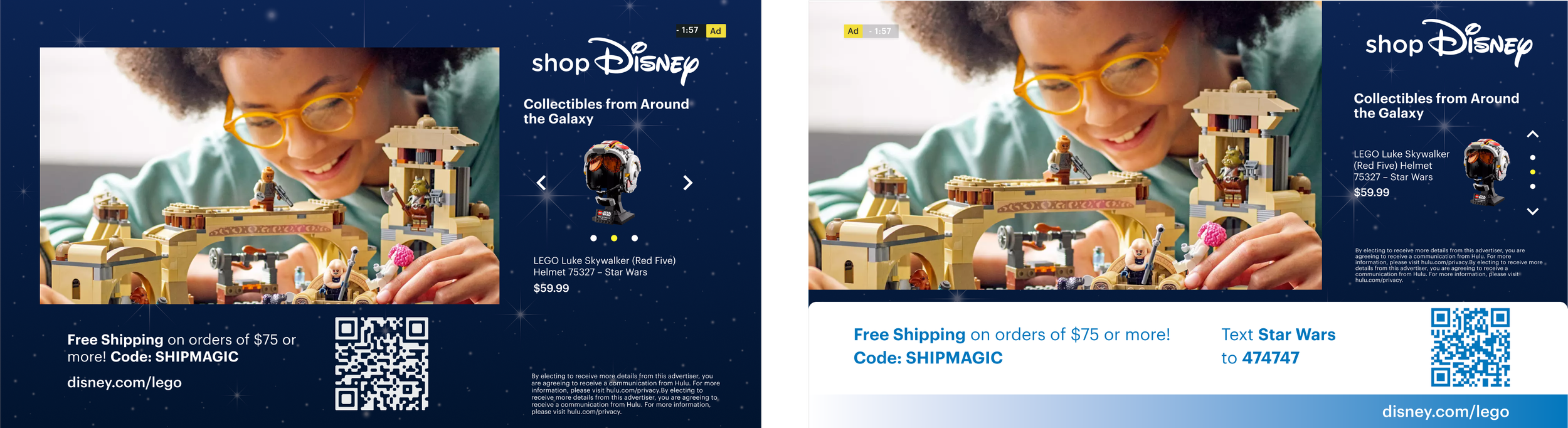
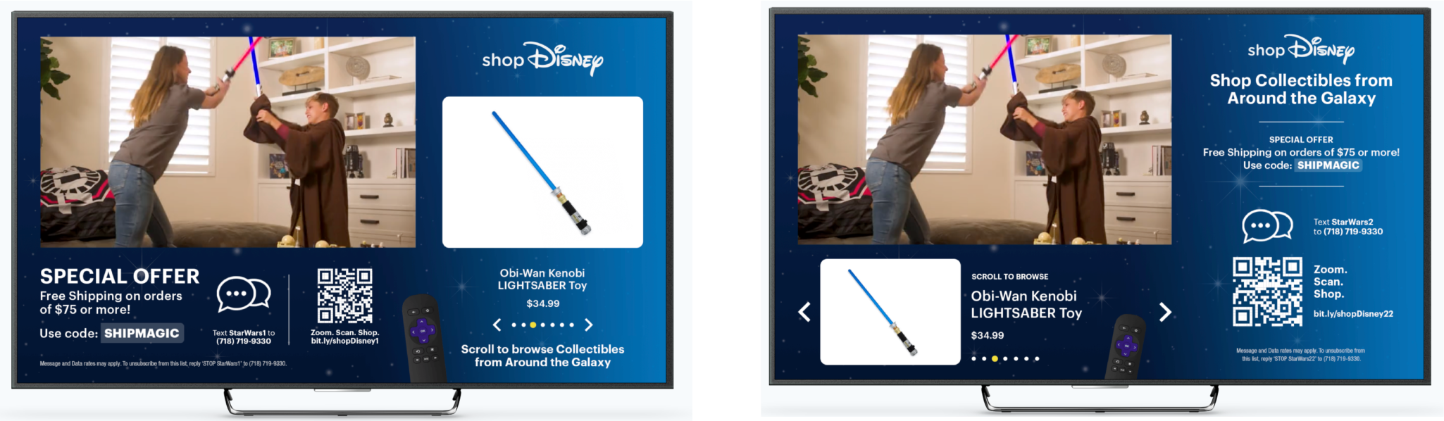
Example of having the QR code on bottom and the carousel of products on the right

Both QR code and carousel on the left
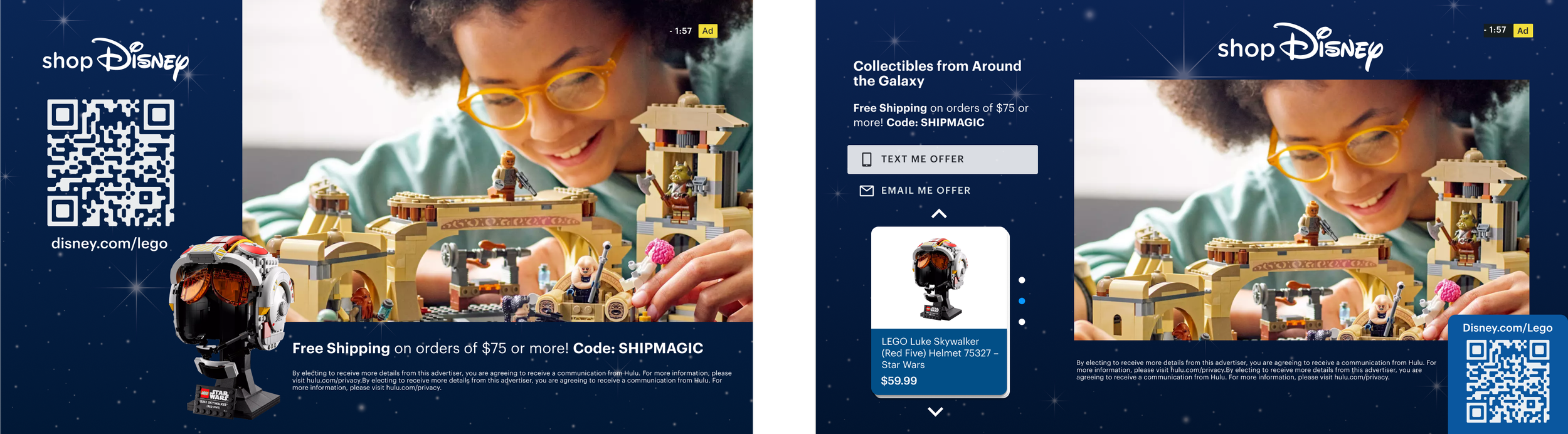
Just QR code (on the left) and breaking out carousel into cards (right)
Interactions
I made a few prototypes of how interactions would work with some of these ad templates. Since I was working on a desktop computer, I added a "dummy" remote control so I could see how a viewer would interact with a TV device.
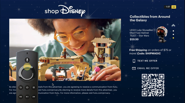
Interactions in vertical carousel design
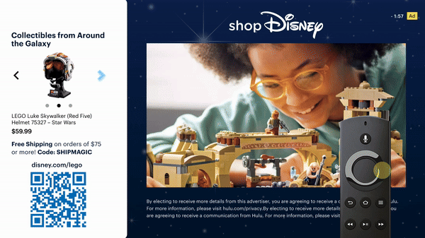
Interactions of horizontal carousel design with "end bumper" which appears once the video concludes
Designing for TV, Tested Remotely
Testing a TV ad remotely was tricky—most tools are made for desktop or mobile, not remote controls.
No access to smart TVs or living room setups
Mouse clicks don’t mimic remote use well
We ending up usinga third-party partner to build a high-fidelity prototype with a virtual remote. It wasn’t a perfect living room test, but it gave us useful feedback on layout and interaction.
This designs was slightly different from the version we eventually tested, but it helped us explore layout, interaction, and visual balance early in the process.
What We Tested
We tested two layouts to understand:
How users react to the ad content
Whether users interact with the ad
If users notice and engage with the call-to-action buttons
User Feedback from the Big Screen
We tested with 8 users in a moderated study. Here are some key findings we gathered.
Too much going on
Most users felt overwhelmed by the amount of information on screen — too many elements competing for attention.
Not understanding the controls
Some users weren’t sure how to navigate the ad with their remote and said they wanted clear instructions or a brief tutorial.

Not engaging with the CTAs
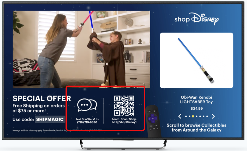
Reactions to QR codes were mixed—some users felt they’d be hard to scan from far away. The SMS option also wasn’t popular; most users didn’t want to engage that way.
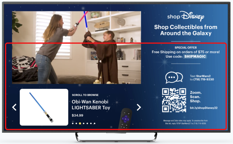
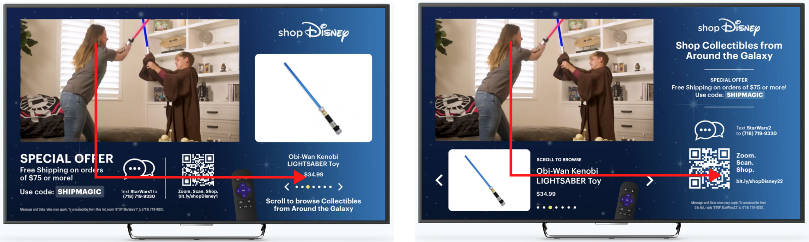
Left side “wins”
Since most users in the U.S. read left to right, their attention typically flowed from the top left to the bottom left, then over to the right side of the screen.
Depending on the layout, they were more likely to notice the call-to-action below the video or the product carousel.
Key Findings
Reduce cognitive load by minimizing on-screen information
Prioritize the QR code as the primary call to action—it was the most well-received
Improve clarity around how to navigate the ad using the TV remote
Passing the Baton
I worked on the initial designs from 2021–2022. While I would’ve liked to see the product through to launch, other priorities pulled me away. Luckily, we brought on new designers who could focus on it full time. By early 2023, I had fully transitioned off the project.
As for the interactive ad (now called Gateway Shop) it went through several iterations after I stepped away. In November 2023, it had it’s beta launch.
