A Smarter Way for Teachers to Record Scores
Teachers needed a faster way to enter test scores for their whole class instead of updating each student individually.
I designed the Class Scoresheet, a feature that allows scores to be entered in bulk, saving time and reducing errors, and giving teachers more time to focus on their students.
Timeline: 4 Months
Outcomes: K5 teachers using ConnectEd had to enter offline test scores manually, a slow and frustrating process. I designed and prototyped a table-style gradebook for bulk score entry and tested it with teachers. The final solution saved significant time and simplified grading workflows, giving teachers more time to focus on instruction.
Paper Tests, Painful Entry
At McGraw Hill Education, the platform included a scoresheet feature that automatically graded online quizzes, tests, and homework. While this worked well for older students, it posed a challenge for K–5 teachers. Many of them used the platform to create assessments but printed them out for students to complete offline—meaning the auto-grading feature wasn’t something they could do.

After collecting the completed assignments, teachers had to manually input scores into the scoresheet to access platform-generated reports. Without doing this, they couldn’t view performance data or identify areas for remediation.
The process was lengthy—teachers had to enter scores for each question, for every student—which made it time-consuming and cumbersome.

Early Designs: Simplifying Bulk Scoring
I knew a new design was needed—one that retained the core features of the individual scoresheet but scaled for class-wide use. This led to the concept of the Class Scoresheet.
I began with low-fidelity wireframes, focusing on simplifying score entry across a full class. One key stakeholder request was an "Apply All" feature, allowing teachers to assign the same score to all students for a single question. My initial design approach drew inspiration from a spreadsheet-style layout, similar to Excel, to make bulk scoring intuitive and familiar.
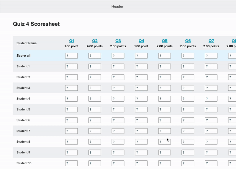
The spreadsheet view offered a quick overview of the entire class, making it easy to scan and compare scores. However, with a large number of students or questions, it could became overwhelming and hard to navigate.
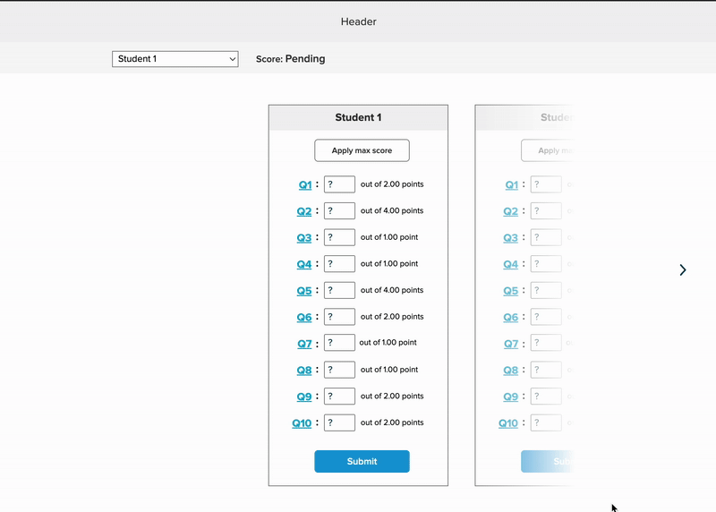
To address this, I created an alternative design focused on the individual student. This view allowed teachers to enter scores one student at a time
Both designs had merit, and stakeholders agreed there wasn’t a clear winner upfront. We decided to test both the class-level spreadsheet view and the individual student view to better understand which approach teachers preferred in real-world scenarios.
User Testing: Fixing the Score Entry Struggle
Pilot Test
Before starting formal user testing, our research team conducted a pilot session with a K–5 teacher. While observing, I noticed a major design issue with the spreadsheet view: the participant struggled to input scores question-by-question within the columns.
“It would be nice if it [the design] was going down vertically here as well, instead of horizontally, it would just looking up and down on here. It's almost harder for me to go up and down and then track horizontally.”
Teachers grading paper assignments typically work student-by-student rather than question-by-question. The original spreadsheet design conflicted with this mental workflow, so the participant preferred the second, individual-student-focused design.
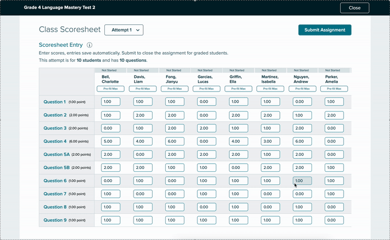
Based on this insight, I revised the designs to place the questions in a fixed left-side column, with student names displayed across the top.
User Testing
Our research team recruited seven K–5 instructors who had experience with two of our major K–5 products, Reading Mastery and Reading Wonders. All were familiar with the existing online scoresheet.
We presented both the spreadsheet design (Design A) and the student-by-student design (Design B).

How we made User Testing more “real”
To simulate how teachers grade printed assignments, we provided participants with PDFs of three scored tests.
We asked them to have the PDFs open on a second screen—or printed out—so they could reference them while entering scores for the first three student
Spreadsheet Design - Design A
Student-by-Student Design - Design B
What did Teachers Think?
Spreadsheet Design (Design A)
Many participants appreciated being able to use keyboard shortcuts like Tab and Enter to quickly input scores. However, a few didn’t realize those shortcuts were available, highlighting a need for better affordance or guidance.
While Design A performed well overall, feedback on the “Submit Assignment” button was mixed. Some liked the ability to submit all students at once, but all participants emphasized the need for a way to exclude students who were absent or excused.
One feature that consistently missed the mark was the “Apply” button, which automatically gave a student full credit for all questions. Participants liked the functionality once it was explained, but the button itself was not intuitive, suggesting the need for clearer labeling or onboarding.
“I do like the format of this and makes it easy to put in and I imagine it would be even faster if I wasn't necessarily looking at a scanned document like toggling back and forth. I think that would be easier.”
-3rd grade teacher
"So what I liked about it is that I clicked on it. Put a number, enter. Next one number enter number enter number entry, like it was it was quicker. It was a lot easier."
-Kindergarten teacher

"The Apply button...I would think would just be to lock the score before you submit it. But I honestly visually. I just as you can see, I totally skipped over that."
-3rd grade teacher
"Yeah, I like that. I just didn't even see that there where it says give max for but now that you pointed that out to me it makes perfect sense."
-Kindergarten/4th grade tutor

Student-by-Student Design (Design B)
Participants found Design B easy to use for inputting scores, and the “Apply” button was much clearer in this layout.
However, there were some trade-offs:
Many participants preferred seeing all students at once, which Design B didn’t allow.
Several noted that since graded assignments are rarely in alphabetical order, they would need to scroll back and forth frequently to match names, which could slow them down.

“I honestly almost even like this better from a type A personality perspective, because if I've got Lucas in front of me. Then I'm just looking at his score sheet. And I don't feel like I have all the other names and everything around me. But I mean, I do like both."
-Kindergarten/4th grade tutor
"It's hard to say. I like the previous one better, that we just submitted...and I think that I liked on that you just start at the top and you just go down to input all the scores."
-3rd grade teacher
Polishing the Experience
Out of 7 participants, 5 preferred Design A and 2 preferred Design B. When asked how the designs could be improved, participants suggested:
The ability to mark students as absent or exempt
Displaying overall scores or averages
Using color coding to highlight high and low scores
Showing the standards or skills linked to each question to help guide remediation
Based on the feedback, I decided to move forward with Design A and made the following changes:
Renamed and styled the “Apply” button for clarity
Added an info icon to explain keyboard shortcuts
Allowed teachers to exclude students from submission
Changed “Submit Assignment” to “Submit Scores”
Added indicators showing which scores were submitted

After more revisions, these final changes were made:
Changed the “Submit Scores” modal to let teachers select which students to submit, rather than selecting all by default
Added support for multiple attempts, showing each time a student retakes an assignment (a late-stage stakeholder request)
Updated the scoresheet layout to clearly display and manage multiple attempts
Design Wins & Lessons Learned
One of the most surprising takeaways from this project was how excited users were about the prototype. I hadn’t fully realized how frustrating the current process was for them, and it was rewarding to see how the new design helped ease that pain.
Here are a few things users said during testing:
"Um, I just want to say thank you for changing this because last year was, it like I...would I would do this on a weekend because it would take so long."
-Kindergarten teacher
"A definite improvement over what we've had, I think what we've had not only isn't that easy to use, but I think it looks really outdated, which turns people off."
-Reading Wonders (K-5 product) curriculum specialist
The Class Scoresheet was never officially launched due to shifting priorities and limited resources. Despite the challenges—especially last-minute scope changes and time constraints—I found the problem-solving process for the Class Scoresheet rewarding.
It was a unique use case, and while the work was cut short, I’m confident the design addressed real user pain points and improved the overall experience.