Background
Mission Control is Disney's internal platform for managing ad campaigns across streaming platforms and distribution partners. Its primary users are non-technical (such as Account Managers and Sales Planners) who rely on it daily to set up, monitor, and troubleshoot campaigns.
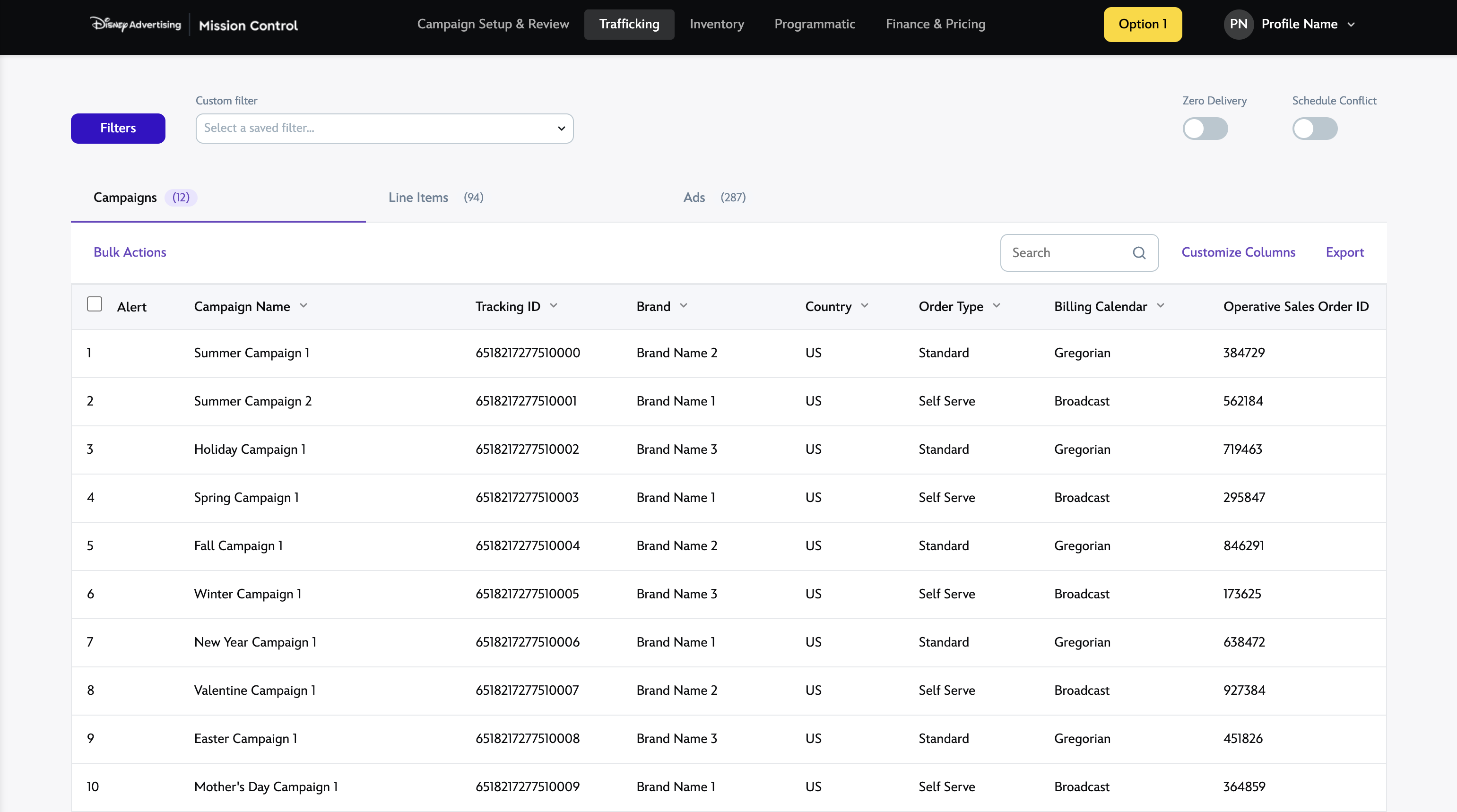
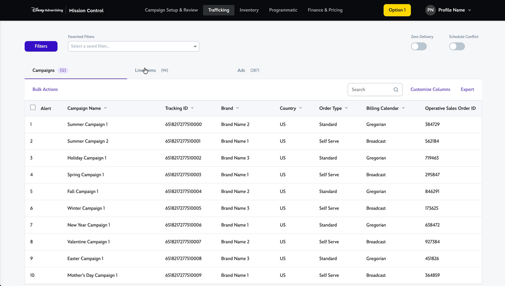
The Trafficking section of Mission Control is used primarily to:
- Set up campaigns (targeting, creative asset, etc)
- Set up how/when ads are supposed to appear
- Troubleshoot (ie when campaigns are underperforming)
Problem
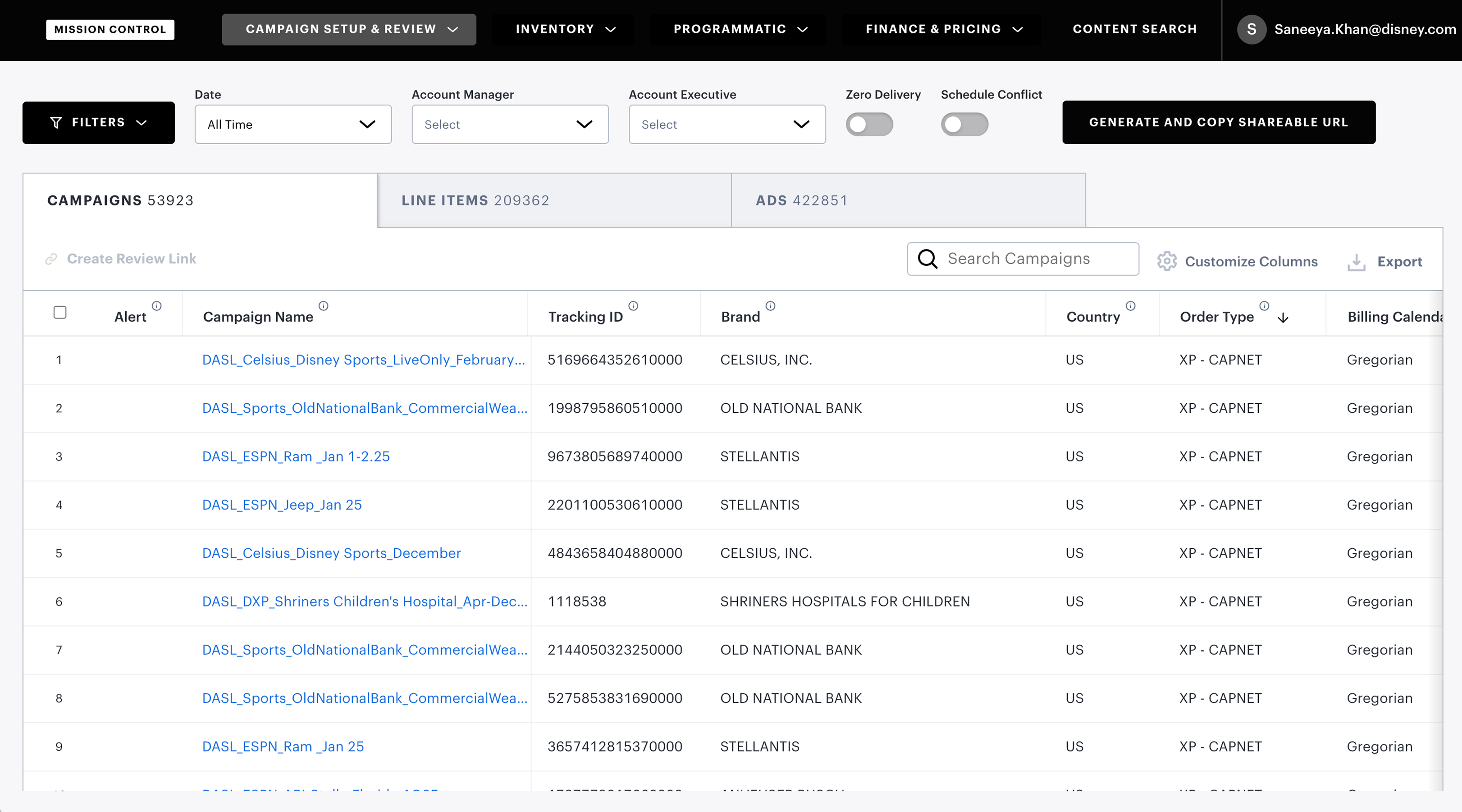
The Trafficking table is inherently dense: campaigns span multiple advertisers, contractual agreements, legal requirements, and content/region-specific targeting rules. That complexity is reflected in the data, making it a significant challenge for users to parse through and find relevant information they need.
Filtering is the primary mechanism for narrowing this data down to what's actionable. But through user conversations and direct observation, it was clear the existing filter system was failing on multiple fronts:
Key pain points:
- Filter list is too long and requires too much scrolling
- Users want more granular filtering (AND/OR, IS, IS NOT, etc)
- Want more filtering options (such as filtering by targeting)
- Want a way to "save filters" and share with team members
Compounding the usability problems, filters had been added incrementally with no consistent interaction pattern; each one implemented differently as new fields were introduced. There was no shared component model, making the system increasingly brittle as the platform grew.
Discovery
Audit
Before designing anything, I audited all 30 filters in the Trafficking tool, mapping each one to its corresponding data column and categorizing by input type. This surfaced the full scope of the existing system and made the inconsistencies concrete. Filter types in use:
- Enum/String: multi-select dropdown
- Date: range picker
- Boolean: radio button / True or False
- Numeric: user-entered numeric value
Other Tools
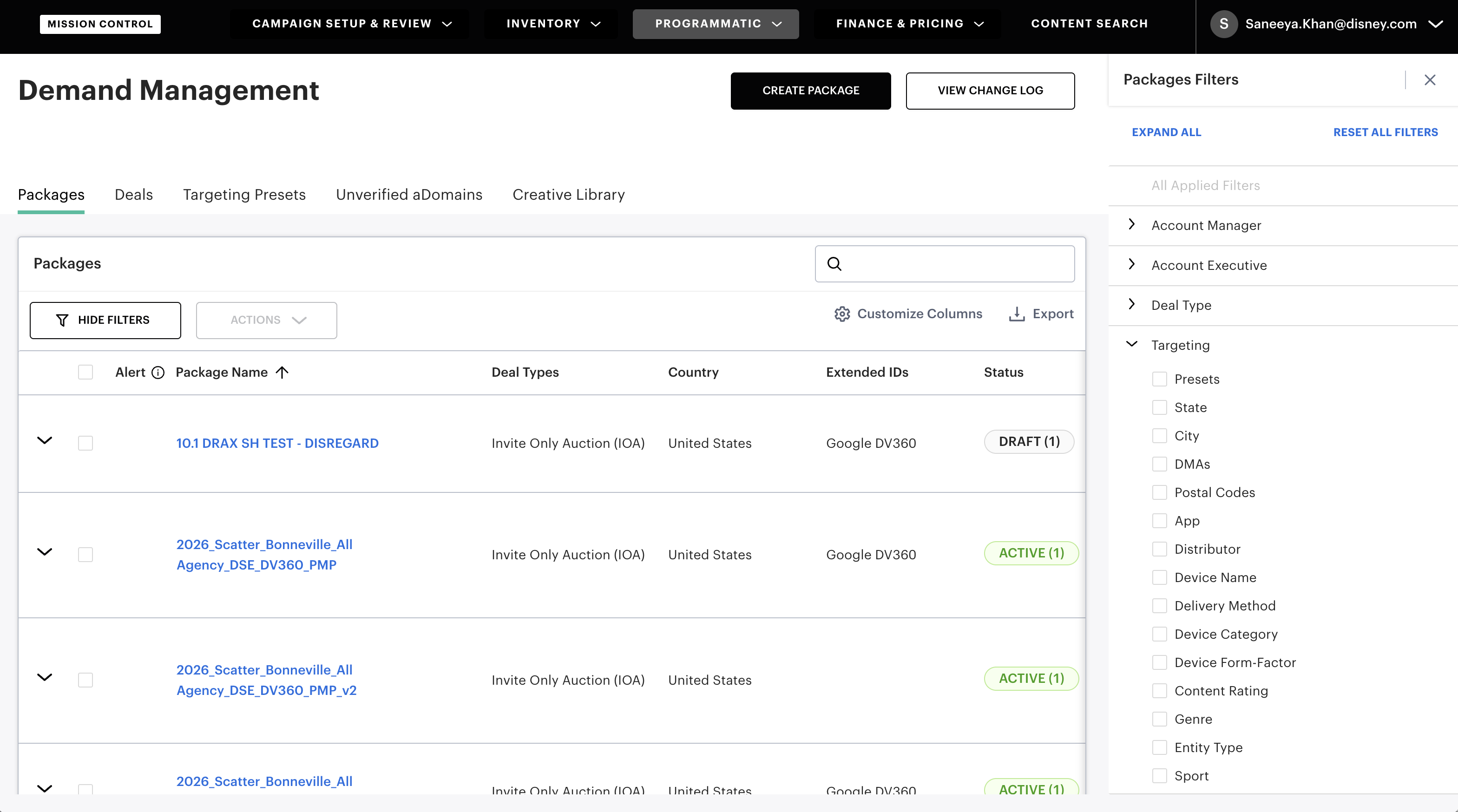
Mission Control spans a wide range of tools with significant UI variation. I audited how filtering was handled elsewhere in the ecosystem and found a consistent pattern: most tools used a fixed side panel rather than an inline dropdown. This established a layout direction that would align with existing platform conventions.
The internal audit established a layout direction, but didn't answer the harder design question: how to support custom filter creation, persistence, and boolean logic in a way that was intuitive.
Designs
Drawing from discovery and the PRD, I defined four design goals to guide the redesign:
-
01
Support saveable, reusable custom filters, shareable across teams
-
02
Improve discoverability by organizing filters into logical categories with search
-
03
Standardize filter UI by data type to enable consistent, scalable extension
-
04
Remove filters from the dropdown list entirely and into a persistent side panel
Initial Concept: Full Filter Page
Moving filters to a side panel solved the accessibility problem: users could filter without leaving the table context. But the more complex requirements (custom filter creation, AND/OR logic, saving and naming filters) needed dedicated space. My initial concept introduced a separate "Advanced Filters" page for this purpose.
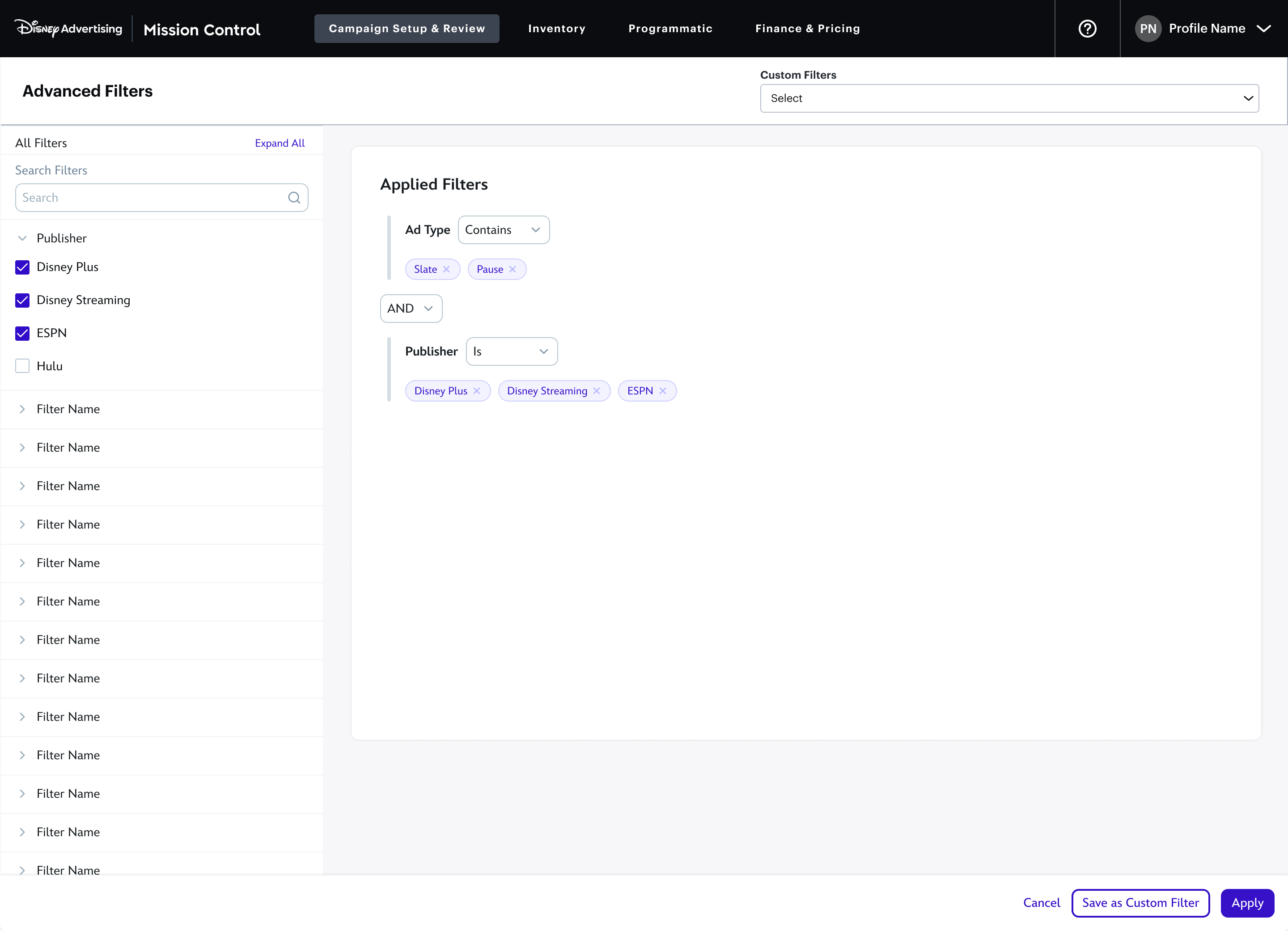
The "Advanced Filters" page surfaced all filters by default, which immediately created a density problem. The goal was custom filter creation, but the page was dominated by navigation rather than the setup task itself. To test an alternative quickly, I built an interactive prototype using Cursor.
User testing on the "Advanced Filters" concept revealed the core issue: CONTAINS/DOES NOT CONTAIN and IS/IS NOT operators, combined with per-section AND/OR logic, introduced cognitive overhead that slowed users down. More critically, the design hadn't solved the scalability problem. It was effectively a long scrolling dropdown with a different visual treatment.
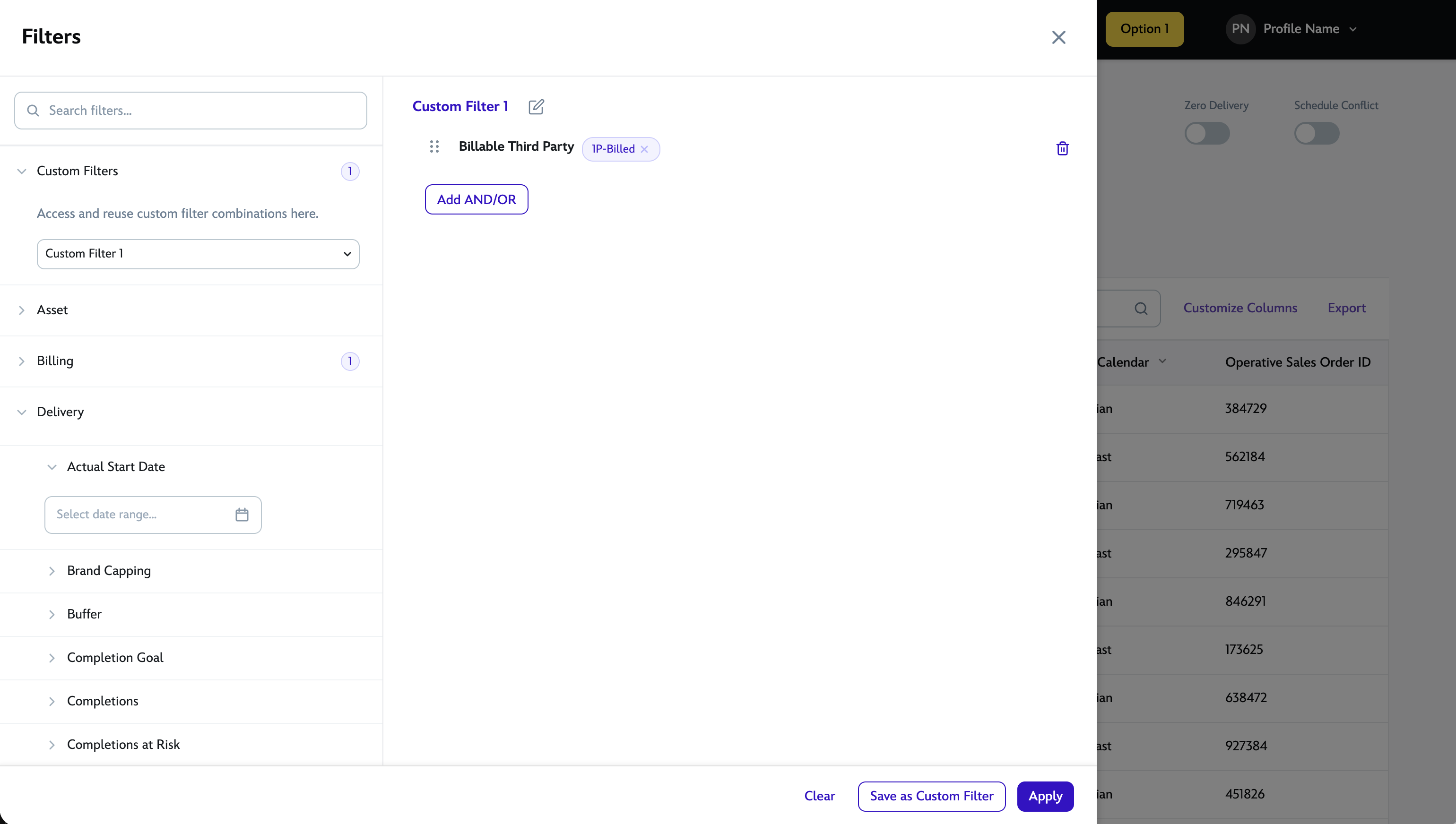
New Concept: Filters in Slide Out
The revised approach consolidated both filter browsing and custom filter creation into a single side panel, consistent with how other Mission Control tools handled filtering, but extended to cover the full requirements. Rather than a flat list, filters were organized into logical categories with a search field for direct access. AND/OR logic was scoped to the applied filters area, keeping the browsing experience uncluttered.
This approach tested significantly better. Users found filters faster through the category groupings and search, and the drag-to-reorder behavior for applied filters was immediately intuitive. The AND/OR toggle addressed the power-user requirement without exposing that complexity to everyone.
Iterations and Tradeoffs
Setting Up Custom Filters
The existing "quick filter" chips above the table (used for common fields like date range and account executive) were replaced with a "Custom Filters" dropdown. This let users apply a saved filter set in one click, without opening the full panel for routine tasks.
Within the panel, users could build a filter combination, assign it a name, and save it as a custom filter for future reuse, directly addressing one of the core requirements from the PRD.
Out of Scope
Filter sharing was a stated requirement but fell outside scope for initial release. The proposed workaround for viewing all custom filters created by any user gave everyone access to others' filters, but created a new problem: the "Custom Filters" dropdown could quickly become unmanageable with hundreds of entries from everyone.
Rather than accept a broken workaround, I did the following:
- I reframed the quick-access dropdown as "Favorited Filters"
- Users could "star" a filter, and this kept the dropdown lean while still enabling sharing
- I added creator attribution to each filter, so users could distinguish between similarly-named filters from different teammates.
Outcome
The feature is currently in development. User testing across both concepts validated the direction before handoff, including the Favorited Filters shortcut for lightweight repeat tasks. Here are a few things I took away from this project:
The categorized panel with search and saveable filters consistently outperformed the existing experience on task speed, filter discoverability, and user confidence during testing.
Prototyping with AI tools (Cursor) early in the process let me test two competing concepts before committing to either in high-fidelity, which saved significant iteration time.
The "Out of Scope" tradeoff on filter sharing was the most instructive moment — finding a design solution that worked within constraints rather than accepting a broken workaround.