Background
Launched in March 2020 as Hulu Ad Manager, Disney Campaign Manager was Hulu's first self-serve advertising platform. It gave SMBs direct access to Hulu's audience with a $500 minimum spend threshold and enabled more advertisers to deliver locally relevant content.
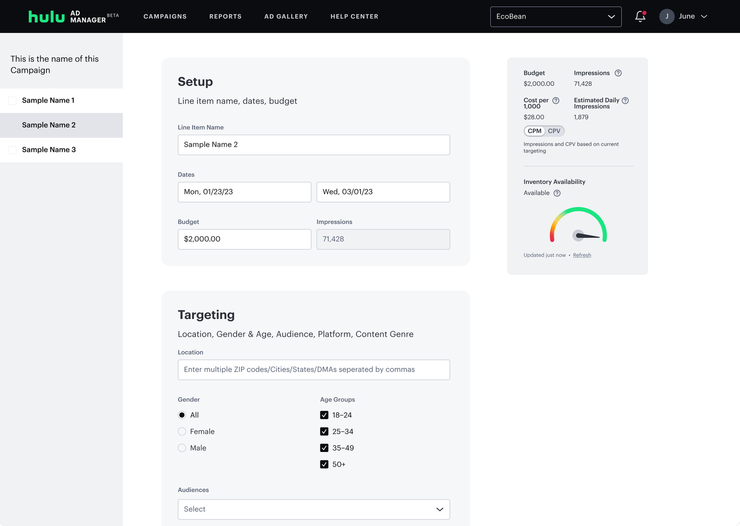
The original platform was designed with simplicity in mind, offering a straightforward campaign setup flow.
Problem
The platform performed well in its first two years, driving SMB acquisition and solid profit margins. But two main roadblocks were in the way for exponential growth:
The platform was built by a 3rd party agency, and we had to go through them for any changes/updates. Reliance on the agency was cutting into margins as the platform grew.
The majority of ad buys on streaming are done through agencies. The platform's simplicity worked for SMBs but failed to meet the sophisticated needs of agency advertisers.
Agencies generate significantly more revenue than SMBs, but the platform didn't have features such as: line items, delivery controls, VAST tags, and deeper targeting.
Capturing this segment meant a complete overhaul:
-
01
Migrating off the 3rd party agency
-
02
Rebuilding the platform on internal infrastructure in order to have complete ownership
-
03
Fundamentally redesigning the campaign workflow
Designs
Constraints
This wasn't just a design refresh, we were rebuilding the entire platform while keeping it live for existing customers. Early on, I knew there would be core challenges:
I would be supporting multiple PMs and engineering teams simultaneously across a full platform rebuild.
Ukraine-based engineering partners required async documentation and more concise handoff specs than I was used to.
Fall 2024. Decisions had to be confident and intentional with limited time to revise core flows.
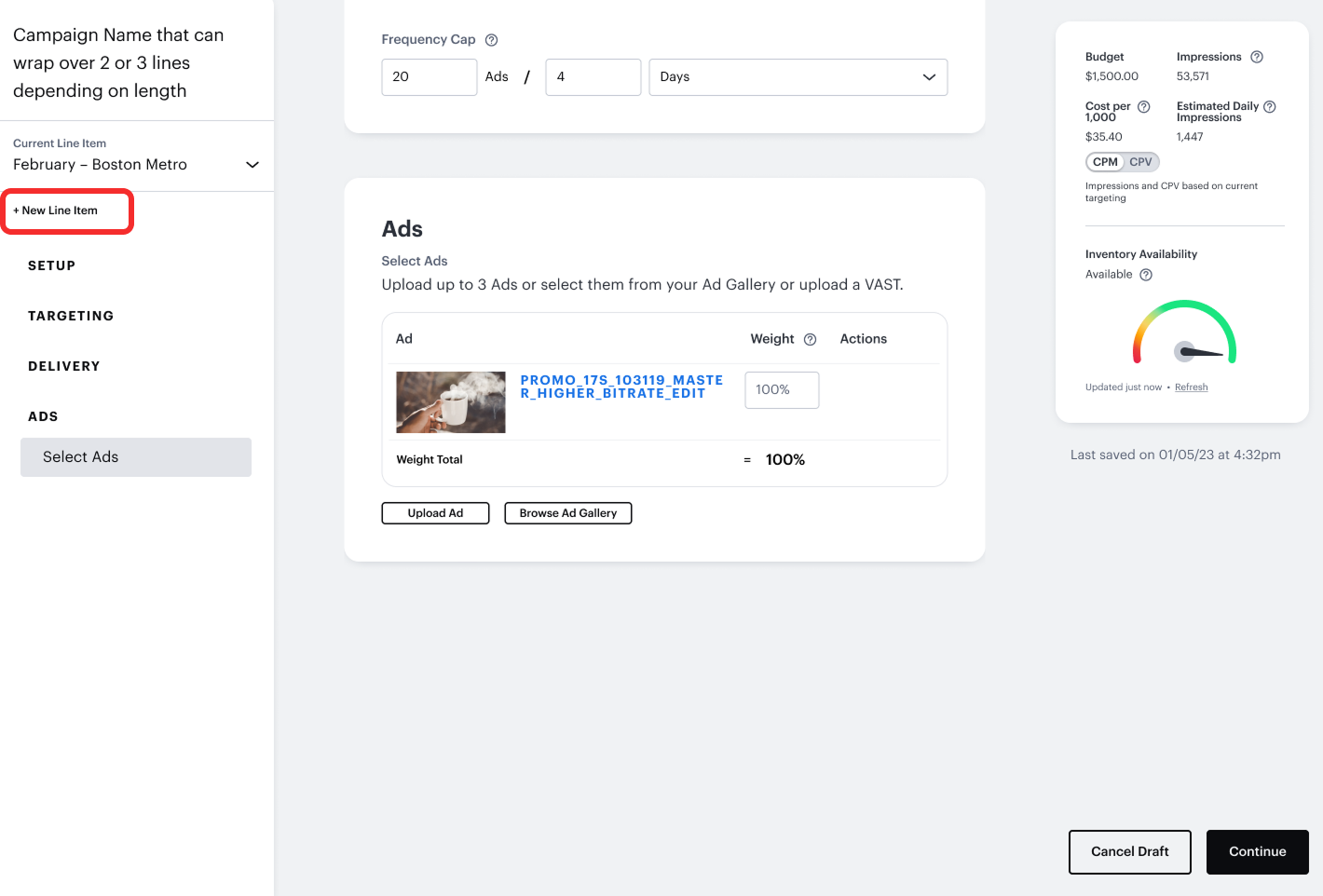
Line Items
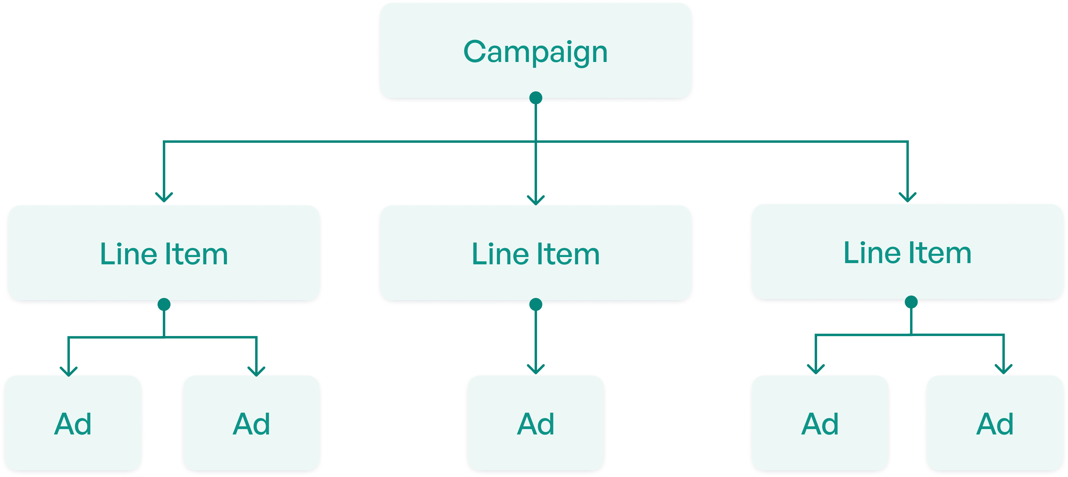
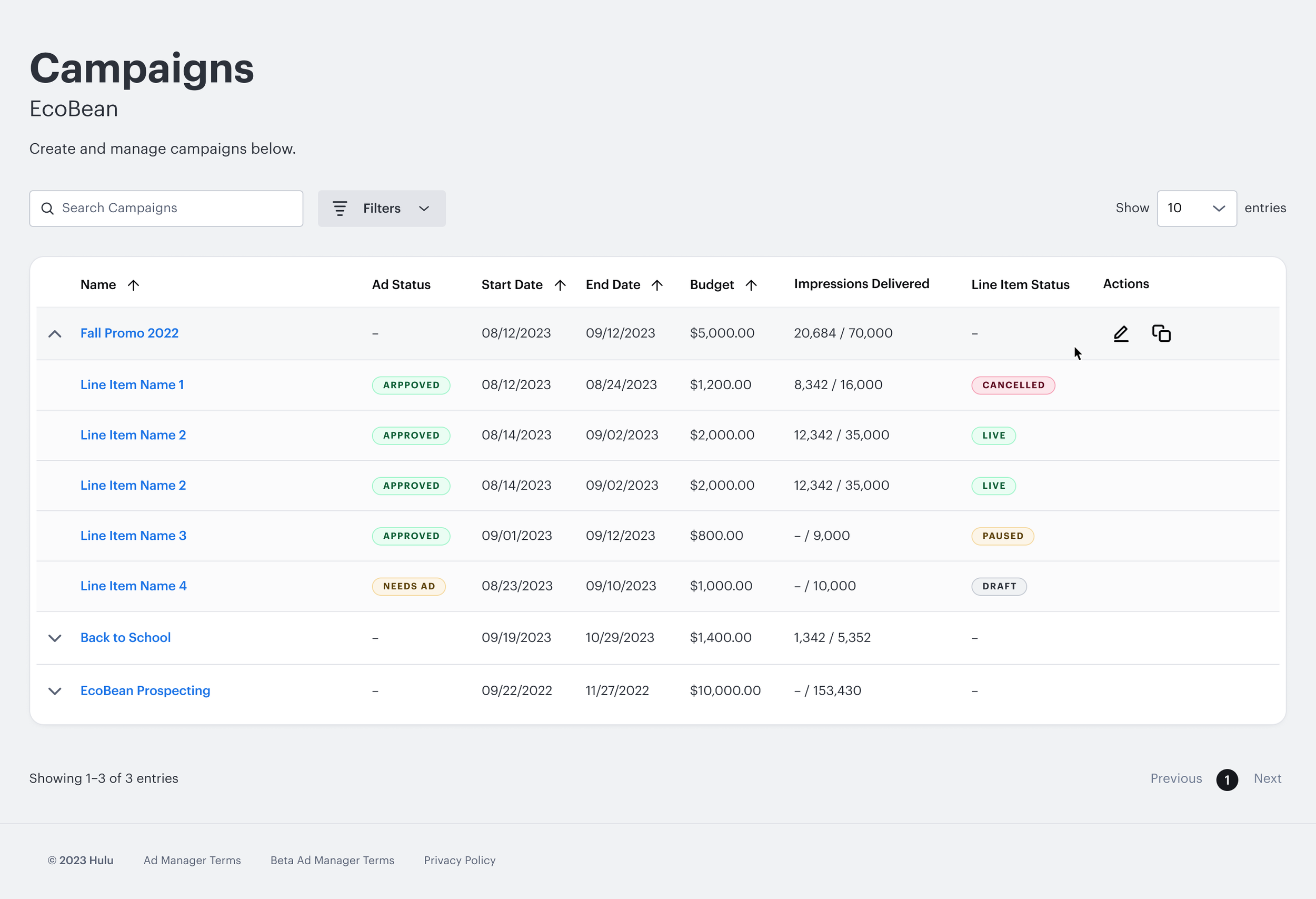
The most critical agency requirement was line items. Line items are sub-campaigns within a parent campaign, each with its own targeting, flight dates, and creative assets.
A standard feature on competitor platforms (also called "ad groups" or "ad sets"), and something our platform didn't support at all. Users could only launch one campaign with a single set of targeting, one ad, and one date range.
Design Explorations
Competitive analysis pointed clearly toward a single-page flow. I decided this would work best because:
- Agency users already had the mental model of a single-page flow, so I didn't want to reinvent the wheel.
- It was the only pattern that could support multiple line items without a confusing multi-step wizard.
Prior user research confirmed the preference, so I switched gears to the harder problem: how to display multiple line items without navigation becoming too complicated.
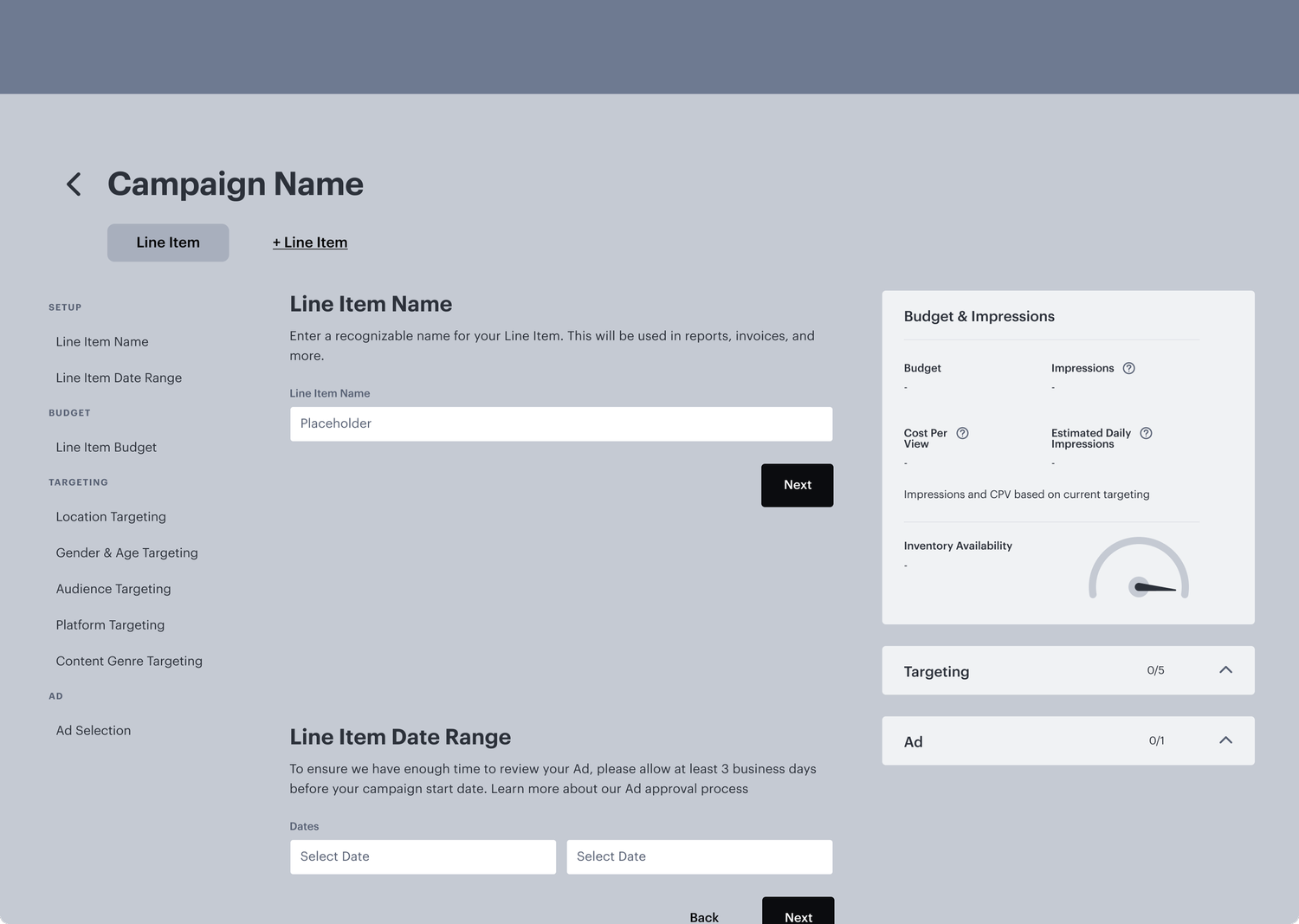
My first explorations used a tab-based pattern — switching between line items felt familiar and space-efficient. I initially believed this would be the cleanest solution because it took up minimal space at the top.
I pressure-tested tabs at scale: with 5+ line items, names truncated and horizontal scrolling became unmanageable. The pattern broke down exactly where agencies needed it most.
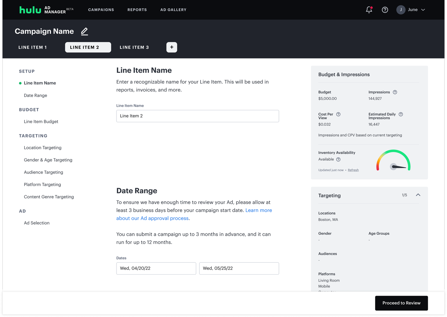
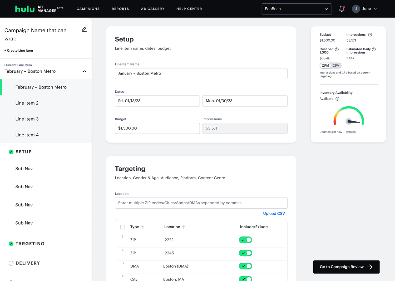
I moved to side navigation patterns. This took up screen real estate, but gave each line item a dedicated row and made the hierarchy between campaign and line item much clearer.
Grouping different sections of campaign creation into cards was useful, because you could see a distinct difference between the steps and this pattern could be scaled to add new cards/features (which it has since launch).
Final: Line Item Navigation
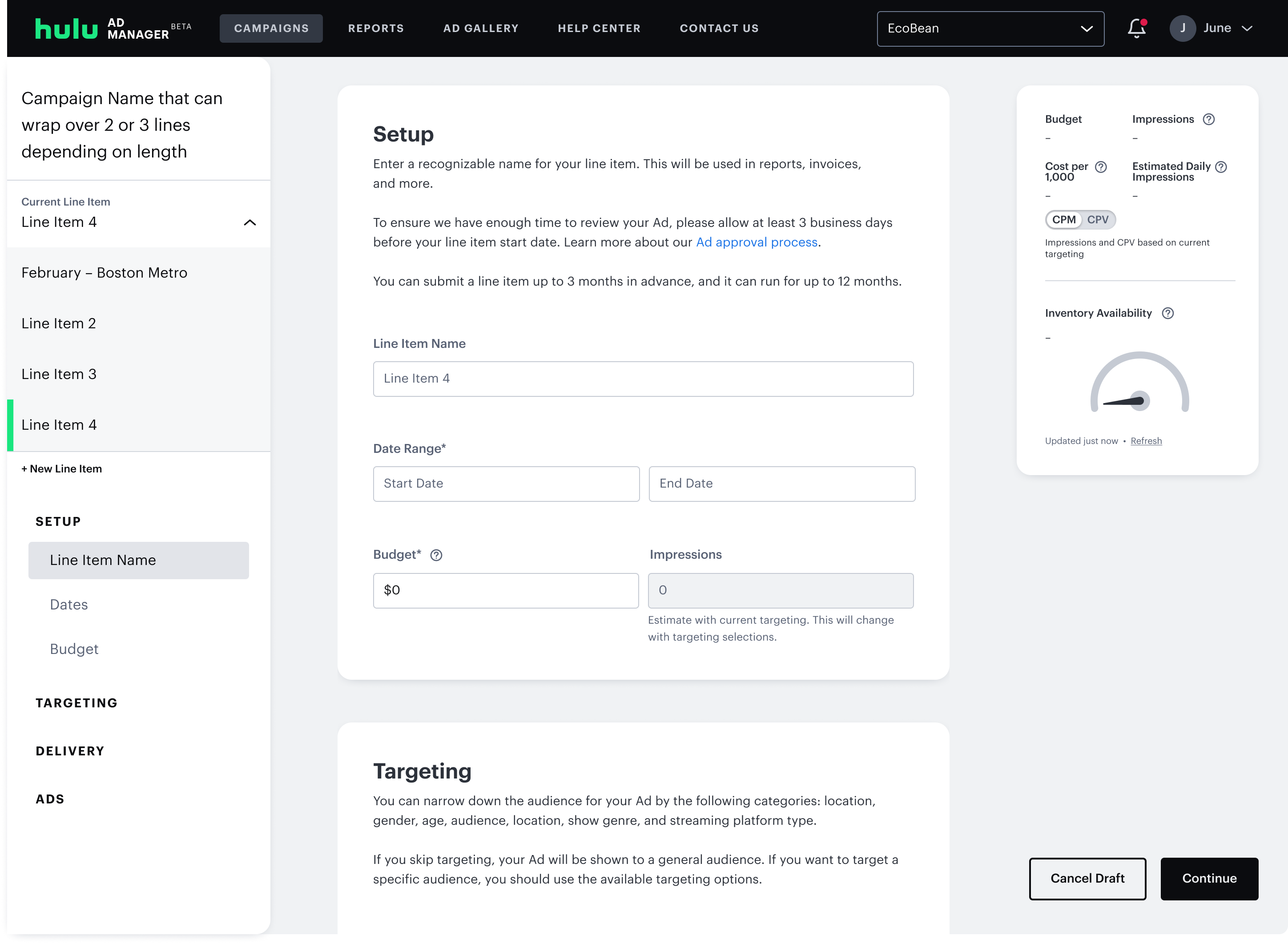
I tested several side nav patterns with internal stakeholders, particularly those who worked with advertisers directly, and I landed on an accordion approach. Users could collapse line items they weren't actively editing and expand the ones they needed in an accordion, reducing cognitive load. It solved the scalability problem while keeping the campaign creation navigation always visible.
Additional Features
With the navigation pattern resolved, I turned to other features agencies expected but the platform didn't have.
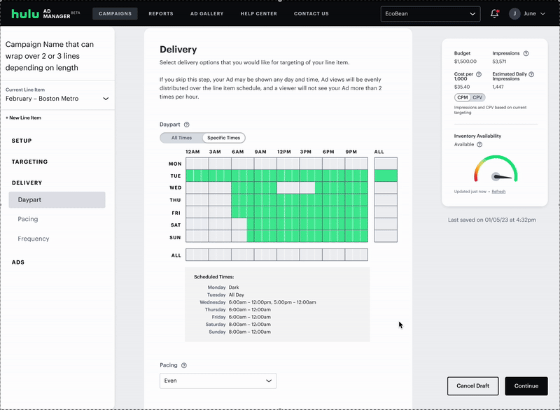
The card layout created a natural home for delivery controls — dayparting, pacing, and frequency caps — settings agencies expected but the platform had never supported.
Another common request was for VAST (Video Ad Serving Template) integration. VAST allows multiple creative assets that could live in a single tag. I added VAST to the ad upload section (for more on this flow, see my case study about adding in VAST).
Final Design
The final flow unified line item navigation, delivery controls, and VAST upload into a single-page experience. Below is a walkthrough of the complete campaign creation process.
User Testing
Testing Without a Research Team
Operating as the sole designer on a 2-year rebuild, I had to be strategic about research. Rather than user test every new feature, I decided to do a usability study focused exclusively on the campaign creation flow, the platform's most significant redesign and the highest-risk area for impacting revenue.
I ran the end-to-end research process: writing the test plan, recruiting and screening test participants, and coaching my contractor on how to facilitate sessions. The locked timeline meant findings would primarily inform post-launch iterations rather than pre-launch changes, a trade-off I documented clearly so the team knew what to expect.
- Evaluate whether the new campaign creation flow improves the user experience
- Assess ease of understanding and overall usability
- 10 individuals with experience running online ad campaigns
- 1-hour moderated usability sessions
Findings
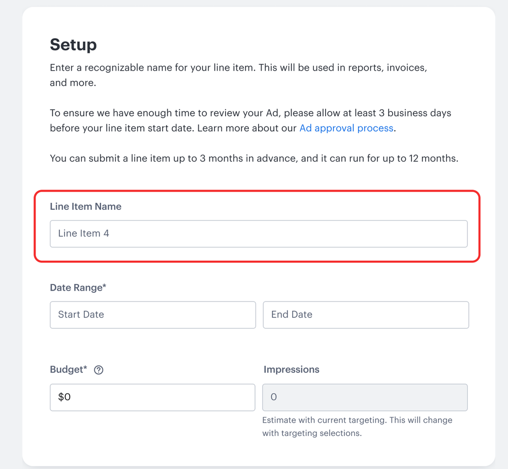
Users appreciated the single-page flow for setting up line item details, but 66% of them struggled to locate the "New Line Item" button when prompted, it wasn't immediately discoverable.
"I just found this whole process just very smooth and clear"
"This was really clean, easy, and way better than Meta"
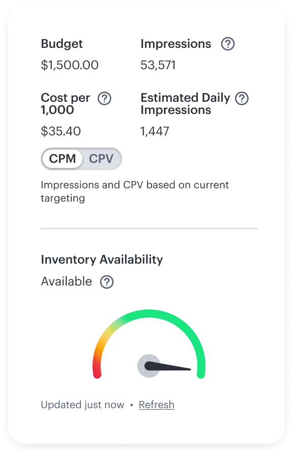
There was confusion around how impressions were estimated, particularly within the custom pacing settings. Some users expressed concern about how their campaign budget would impact impression delivery.
"If the ad was doing well…am I going to burn through my budget sooner?"
"How are we arriving at the 28,000 impressions for a $1,000 budget?"
The term "Line Item" confused some users. Even those familiar with the concept typically encountered it as "flights" or "ad groups" on other platforms.
Most users navigated the flow with ease, the single-page structure achieved its core goal. A few described the UI as "plain" or lacking personality, feedback that directly informed the visual refresh that would come out with the Disney Campaign Manager rebrand.
Impact & Takeaways
The redesigned campaign creation flow launched in October 2024. I maintained a dedicated JIRA epic for post-launch design improvements, triaging issues by user impact and engineering complexity. Engineers were working through the backlog within weeks of launch — for example, making the "New Line Item" button more discoverable shipped shortly after.
Notable new capabilities included cross-platform targeting, allowing advertisers to run campaigns on Disney+, Hulu, or both simultaneously. Following the platform's rebrand to Disney Campaign Manager, the interface received a full visual refresh. We've maintained an ongoing feedback loop with advertisers and internal stakeholders since.
In hindsight, I should have pushed earlier for a clearer scope and dedicated design resourcing. Working across a platform rebuild, feature additions, and multiple PM teams simultaneously made it difficult to set realistic timelines.
What I would do now:
- Set up clear design scope and priority so I can make a deliverable schedule.
- Secure contractor support earlier so design capacity would have had more time for iteration & handoffs.
- Do more frequent user testing throughout the process and test more features.
Since this was a significant project, there were many tradeoffs.
-
01
I had worked on bulk editing for line items where a user could edit multiple line items at the same time. It was more of a "nice-to-have" vs a critical need so it was cut from scope.
-
02
Other targeting options were also cut, such as retargeting where I had made flows where users could target viewers who had already seen their ads before.
-
03
The term "line items" confused testers and some internal users. I urged PMs to call it something more typical such as "Ad Groups" or "Ad Sets". They countered that they wanted consistent naming conventions with our internal tools. Ultimately I had to let go because it could easily be changed if needed.